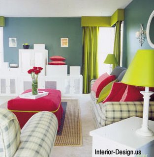
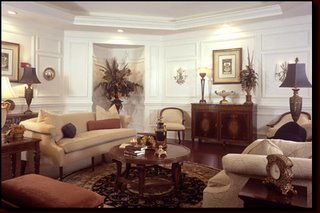
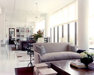
Have you ever wondered why interior designers place slippers on the ottoman in magazine photos? They do it to make the staged setting look as if it's a lived-in room. Pictures and illustrations in decorating books, magazines, and other advertisements are designed to sell a product or an idea.  But what's missing in the staged rooms of most interior design books and magazines? People. When it comes to decorating your own your home, forget the empty rooms you see in the magazines and books. You should design your rooms as backdrops for the people who use and live in those spaces. In order to best utilize the spaces in your home, try these simple techniques:
Leave empty space.
Empty space gives you breathing room and allows the most important items in the room to shine, which are the people!
Use small patterns on walls and furniture.
Avoid large-patterned fabrics and wallpapers with designs larger than your head. Huge florals will interfere with the appearance of the people in the room. You don't want to have to compete with bold patterns behind your face. Patterns on sofas and chairs that clash with clothing will also make you and your guests feel uncomfortable.
Use colors that complement people.
Finding the right colors to complement your skin and eyes deserves planning. Most people look great when surrounded by color. For light skin colors, use yellows, pinks, and beiges. For darker complexions, yellows, olives, and tans can make people stand out. Since most people no longer have bright white in their eyes, avoid pastels that are whiter than the white in your eyes.
Add textures that feel good to the touch.
Support your sense of touch by adding textures that are nice to caress. You don't have to touch velvet to sense its softness, and soft textures like chenille and satins will visually support your feeling of being pampered, as well.
Arrange accessories to shore up emotions.
In one of my rooms, I arranged my mantle accessories to make a statement, and it looked great  in photographs, but after analyzing why the mantle didn't seem to smile, I realized that it wasn't personal. When I filled it with Mili fiori lamps, crystal candlesticks, and antique vases, the space looked great, but it really began to smile when I added a Mexican Rose rock under the painting.
Think comfort before pretense.
Just because a sofa or chair looks fabulous doesn't mean the piece is comfortable. Remember, when you walk around a showroom, sitting down on any piece feels good, but in order to truly test a piece of furniture, you need to sit on it for a long time, until you feel totally rested. Only then will you be able to feel the real support and comfort level of that piece.
Remember, your home is a place for people, and when you and your guests look and feel great in your home, you can be sure that you've designed a great setting; one that far outshines the staged sets you'll see in magazines and books.
How to Decorate Spaces for People
When it comes to decorating your home, forget about the empty, lifeless rooms you see in interior design magazines and books. Instead, you should concentrate on designing all of the rooms in your home as backdrops for the people who will be living in those spaces. Here are a few simple techniques for designing dynamic spaces:
Don't be afraid to leave some empty spaces in your rooms.
Empty space allows for breathing room and lets the most important items in the room shine -- the people who live there!
Avoid large patterns in your fabrics and wallpapers.
As a general rule, use no designs larger than your palm, because they will interfere with the appearance of people in the room. Using smaller patterns on walls and furniture will mean that friends and family won't have to compete with bold patterns for attention.
Use paint colors that complement people's skin and eye colors.
For light skin colors, use yellows, pinks, and beiges. For darker complexions, yellows, olives, and tans can make people look great.
Use textures that stimulate the sense of touch.
Look for textures that are nice to caress, such as velvet, chenille, or satin. They'll create a feeling of being pampered.
Always choose comfort over pretense.
 Just because a sofa looks great doesn't mean it's comfortable. When you visit a showroom, remember that in order to truly test a piece of furniture, you need to sit on it for awhile, until you feel totally rested. Only then will can you get a realistic feel for its support and comfort level.
Your home is meant to be a place for people, and if you always keep yourself, your family, and your guests in mind, you'll be well on your way to designing spaces that will be more comfortable and emotionally appealing than the staged photos you see in magazines and books.
Home Decorating Tips - How to Change a Rooms Dimension using Wall Pictures
The Basic Role of Pictures
Wall art plays an important role in interior design as it helps create the ambience of a room. By cleverly placing wall pictures in certain ways, you can change and create a new look and feel in a room.
The role wall pictures play in interior design are:
pictures, mirrors or other ornamental accessories on walls help make the room look 'lived in' and they also inject your personality into the room;
color pictures and prints help connect with the rooms accent;
pictures help absorb noise in a room, otherwise a room with totally bare walls will sound empty and will have an echo;
pictures and prints can help enhance or change a room's 'look and feel'.
How To Lengthen A Room
If you have a small room in your house, you can easily achieve the illusion of length. This can be  done in two ways. If you like bold statements then simply paint a couple of horizontal lines in a bold color across the middle of the wall in which you want to lengthen. These lines then naturally create the illusion of increased length in the room. An alternative way to do this, and a more subtle way, is to use pictures.
By strategically placing art pictures or photographs with any kind of strong horizontal line in the print, can accomplish the illusion of length. For example, if you chose two or three long rectangular pictures with horizontal panoramic prints such as ocean & beach pictures, fields, or scenic mountain pictures, then this will help extend the length of the room naturally.
Two, three or more of these horizontal landscape pictures will give the maximum impact you are looking for to help lengthen a small room. Also bear in mind not to overdo the room with furniture. Too much clutter makes a room appear smaller.
How to Broaden a Narrow Room
 If you have a room which is a bit on the narrow side, there is a simple strategy to make the room appear broader. All you need is a tin of paint, a wall mirror and a large colorful wall picture.
Get your tin of paint, which should preferably be a darker contrasting color to your other walls, and paint one of the walls with this darker paint. Find a colorful and lively large painting and hang it on the wall you have just painted - colorful flower pictures are ideal for this.
On the wall adjacent to your picture, hang a decorative large mirror. What has happened here is that the mirror reflects on the large picture, and the additional darker color on the wall has immediately given the room some much-needed depth. This combination will then make the room appear wider.
By adding these simple additions to your narrow room, you have instantly created a balance in the room's dimensions giving the sensation of additional space.
How to Heighten a Low Ceiling
Rooms with low ceilings give an oppressive feeling, whereas rooms with a high ceiling give a light  and airy feel with a large amount of space. To overcome the problem of a low ceiling, there are a couple of interior design strategies to use. First of all put down a darker floor covering, whether it be a wooden floor, carpet or lino. Paint the walls with a lighter color than the floor, or use light colored wallpaper. If you can, use white paint for the ceiling as this always gives the room maximum light and instantly draws the eyes upwards.
Hang up wall pictures with strong vertical lines as this then gives the impression of height. Use portrait prints such as vertical landscapes, i.e. lighthouses, trees, cityscapes, or floral prints such as flowers in a vertical vase or tall long stem roses. Therefore, by combining the dark floor, light walls and ceiling and portraits prints, all adds to the sense of height in a room.
Decorate Yourself Happy: How to Decorate For Everyday Pleasure/Joy
Because psychologists relate true happiness to joyous occurrences happening frequently, decorating your home to promote everyday pleasure makes sense. If you're planning a home makeover, provide for the cumulative total of all the little pleasure moments.
When people rate their happiness, it is the ratio of pleasant to unpleasant emotions and experiences that count. These happy experiences may be simple pleasurable, everyday happenings, not always grand events.
Design Psychology, a new method for residential interior and exterior design starts with planning spaces to support emotional well-being. Homes decorated to support desired emotions create happy spaces for joyful living.
Design Psychology Ideas for Pleasure
1. A tea table in the Main Bedroom provides an intimate space for conversation or individual reflection.
2. A reading nook provides a quiet space for escape.
3. A game table provides a place for playing together.
4. A meandering pathway in the garden provides an enticement to stroll.
5. A garden bed provides the perfect place for relaxing and leisurely afternoon naps.
I mean a real bed, not a flower bed, although you need flowers too!
|

